WANDERLIST

About:
Wanderlist is a social local events app that provides a new service to help users find out about cool events happening locally, with a focus on food, art, and music events.
Project by:
RookieUp
Roles:
UX / UI Designer / Researcher - Henderson Yan
Programs Used:
Sketch
Photoshop
Invision
Procreate
THE PROBLEM
Your client is a pre-launch startup that wants to create a event discovery app whose events are populated entirely by users. They want the events to be from a small group of “tastemakers”, people who have connections to the world of underground art, dining, and music. They want to showcase interesting free events that people couldn’t find out about anywhere else.
The user app experience:
Simple signup and quiz about the users interests to tailor events shown to the user’s interests (The client also wants to showcase events that don’t fit the user’s interest to help broaden their horizons)
Users should be able to easily sort and filter events, and then click into each event for more information. They should also be able to share, add to calendar, and go to the event’s website (if relevant)
The tastemaker app experience:
30 questions onboarding process that limits spammers and self-promotion
Tastemakers will need to submit personal information that will be reviewed by a member of the client team
A Tastemaker dashboard that lets them easily see all past and current events and a simple editing tool to create new events
Constraints:
Users must be able to sign up quickly via Google or Facebook authorization
Users must be able to sort and find events by city, neighborhood, date, type (food, music, etc.), and ambiance
Event detail pages must include image galleries, descriptions, link to website, Add to Calendar button, Share button, RSVP button (connects to Facebook), Save, and a More Details section
Tastemaker onboarding process must allow for 30+ question quiz
INSPIRATION


I began my research by looking at other event-focused apps. Each one I looked at had interesting takes on how they handled content.
Eventbrite is a popular one and does a good job especially when it comes to a clean design and searching for events. DoStuff had that modern feel and hip aesthetic that I wanted especially for an app that dealt with more of the underground scene.
Facebook isn't event focused, but has a great community feel and the project called for Facebook integration. It was important to know the interface and made sure it was similar. I look to Yelp to look at their filters. I felt as though they did a good job dealing with all of their content and allowing people to sort through.
PERSONAS


I made personas that I felt as though would fit across the wide range of users that I was designing for.
Target Users:
18-25 Years Old
Male and Female
Students and Working Young Adults
Single and Married
IDEATE & SKETCH


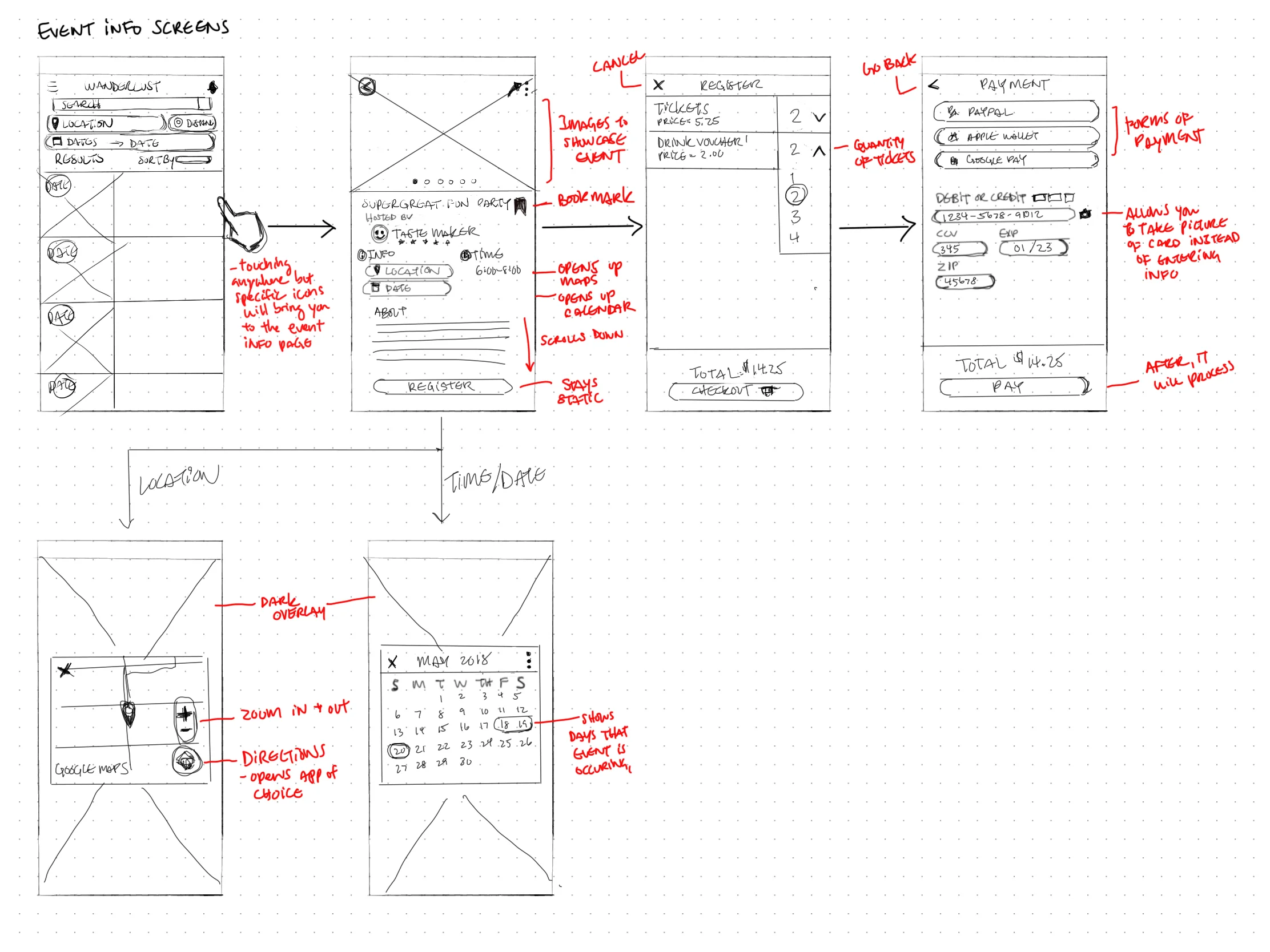


I began my sketches looking at different ways the home screen could look. It was experimenting in different ways and trying to understand what was the best way to handle the content I had to show to the user. I had to make sure to show as much information without overwhelming. Writing out the different functionality definitely helped in thinking through usability.
WIREFRAMES
Wireframes were crucial in testing out to work out early usability problems. I had friends and kind strangers from coffee shops test out the early versions on Invision. Doing the wireframes in Sketch made it clearer and feel like an actual app for user testing.
Some of the problems included:
Content was too close to each other
Swiping through events on the Home page was not intuitive
Icons being too close to one another


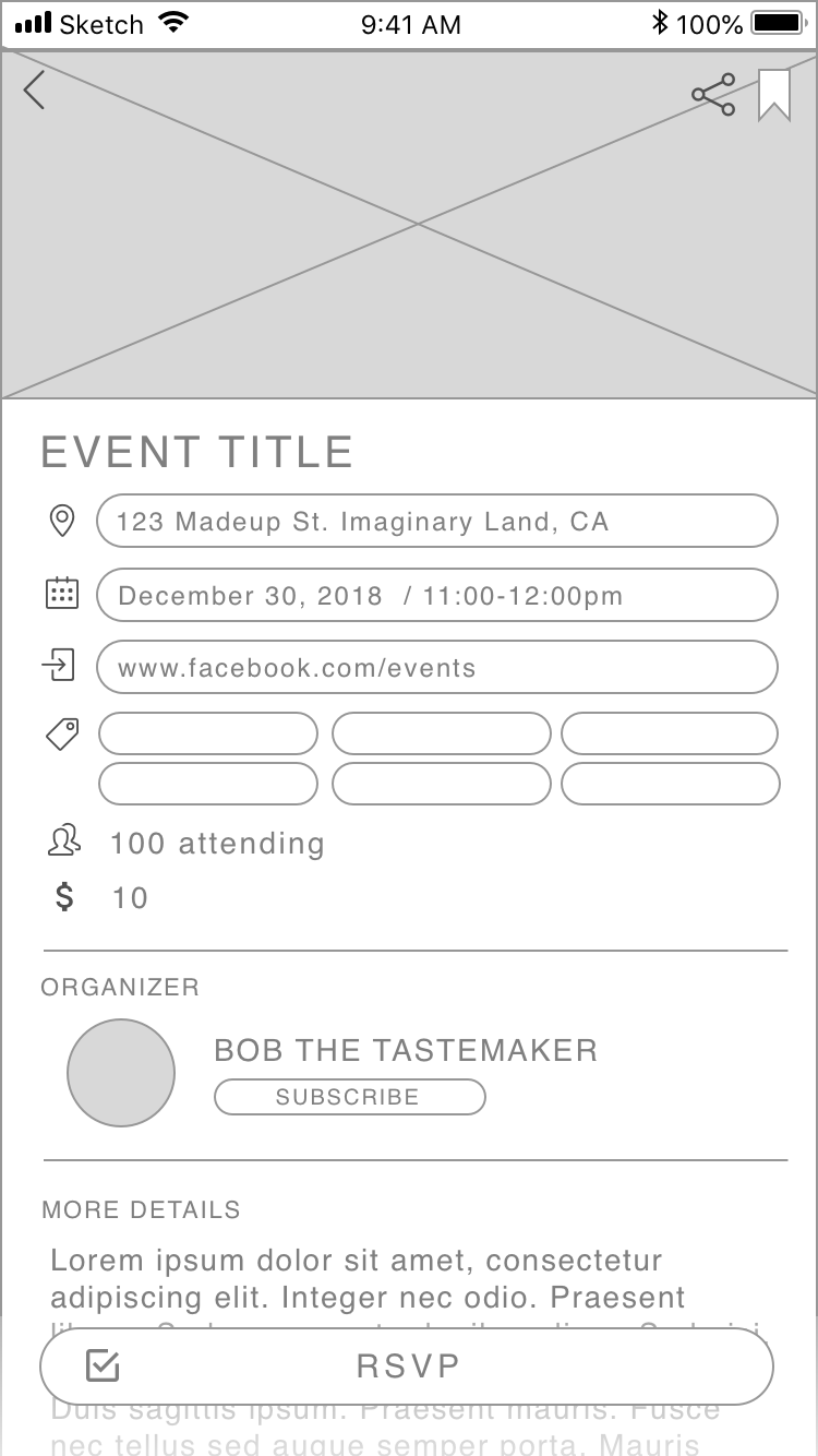

FINAL SCREENS
After testing with the wireframes, I made changes to the layout of the screens. I made sure to check readability with different colors. It definitely added another dimension of design. With some more user testing, I made changes based on feedback. One of them was the search filter being too crammed. Another was a lot of information on the event info screen. In the end, all the edits really did help improve the overall design.


DELIVERABLES
PROTOTYPE
The next steps in iterating was to improve on early user testing bugs and to clean up the design of the app.
Features Include:
Signing up and login via Facebook, Google, and email
Sign up form
Going through navigation
View event info for "NorCal Night Market"
Share events
Signing up for "Tastemaker Experience"
Create Event
Logging out
FINAL THOUGHTS
Next Steps:
Figuring out how to make the home page less cluttered. The best way may be to only show one event per row.
Improving the Tastemaker Home Screen to provide the information in a clearer way.
Finding another way to display the date without orange. Since orange is such a strong color, it can be used to get the attention of the user. However, too much will just distract the user.